2013 MoonBlog
This isn't really about the moon, I call it a moonblog because a new homepage image appears twice a month on the new and full moon. The home page shows a featured image —sometimes freshly minted, sometimes seasonal, sometimes from years past— along with improvised ruminations. Previous years’ entries are here for your perusal, something like a leisurely blog. See the links, above.
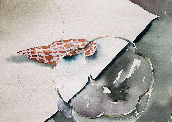
Murex
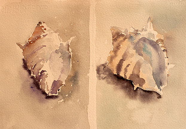
Two watercolor studies of a murex shell (from the family Muricidae). The name murex comes from the latin word for “purple-fish”; one variety being the source of Tyrian purple. In the ancient Mediterranean world, this dye was the very expensive “royal purple”, prized for its depth and permanence, its use permitted only by ruling families. One story has it that the dye was first discovered in the 2nd century B.C. by Heracles, or more precisely, his dog, whose mouth had been stained purple after chewing on a hapless murex (or maybe several murices!) but archeological evidence indicates that the dye was in use as many as sixteen centuries earlier. The color itself comes not from the shell but from a mucous secretion of the shell's inhabitant. None of this was known to me as I painted these two shells in my studio one afternoon several years ago.
Full Moon ~ December 17th, 2013
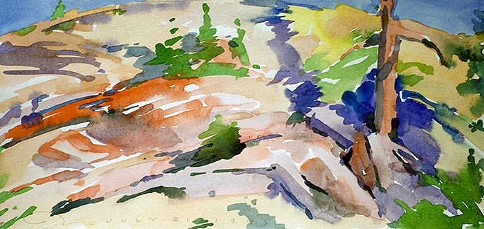
Chiarraí
The title Chiarraí is the Irish name of County Kerry. The name comes from the pre-Gaelic people who inhabited the place, the Ciar as they were called, in the southwest of Ireland. Kerry's stark beauty has been the scene of much of the country's centuries-long territorial turmoil and some of its most eloquent preservation of Irish language and culture. On my first visit to Ireland in 2003, I heard a story from the venerable Irish poet Anthony Cronin. He told me that Valentia Island in County Kerry (where my grandmother was born) was the first land that Charles Lindbergh spotted on his epic 1927 trans-Atlantic flight. According to Mr. Cronin, Lindbergh was flying low in fog and swooped low hoping to get within shouting distance of some fisherman to ask where he was. They were able to shout back that he was approaching Valentia Island. From this Lindbergh was able to get his bearings and continue on to France. I'm not sure if all of this is true or not, but what do you want, the truth or a good story? Lindbergh did fly over Kerry, much to the astonishment of the ancient ghosts of the Ciar.
New Moon ~ December 2, 2013
Persimmon with Salt Shaker and Plate
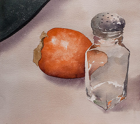
Here’s a watercolor painting from just yesterday. It’s been a difficult autumn of natural disasters, too much schoolwork, and a few too many deaths nearby. Last week I got back into the studio for the first time in what seems like many months. I’ve embarked on a watercolor binge in advance of a holiday painting clearance sale, something we haven’t done in many years. It’ll be a one-day event on December 14th; stay tuned.
The painting here is a recurring theme; something I find myself coming back to like comfort food. This is a helpful skill when you’ve been away from the kitchen for a while. It can provide an entry way back into the activity. Creative activity is easily put into hiding by an overly busy life; it sometimes requires some coaxing, cajoling, and outright trickery to get it out into the light again.
Full Moon ~ November 17, 2013
Angelic Entity with Diagram
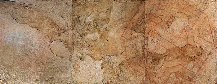
A few summers ago I was spending a lot of time in the studio trying to come up with work for a sabbatical exhibition. That particular summer had been preceded by a long fallow period, perhaps one of the longest stretches of inactivity in many years. Getting back into it is painful, as when you let yourself get out of physical shape and then try to be active as if you'd never left off. Well, the summer in question saw some very strange paintings. Here’s one of them. This painting was all the stranger for its size: it’s 42″ x 108″ in three panels. The angel image is based on a copy of a drawing of Victory Crowning the Poet, or something like that. I’ll look up the artist’s name in a moment. The diagram is copied from a much earlier source; it’s from the sketchbook of Villard de Honnecourt, a mysterious medieval artist. There is no intended meaning to this combination. In fact, this painting has since been painted over. It had a strange hold on me for some weeks; but, as John Lennon sang, “...love has a nasty habit of disappearing overnight.” So does interest in a painting that strays into a conceptualized version of itself. And, really, it isn’t the painting that strays!
New Moon ~ November 3, 2013
Glass Bowl, Shell &c.
This watercolor dates from some time in the late 1990s. It was part of a continuing fascination with the way glass both reflects and bends light. Okay, I know it's kind of a trick. Still, painting this light refraction can be a practice of suspending assumptions; in this case the assumption that you are painting a solid thing, such as a glass bowl. Instead, you paint – completely literally – the shape distortions of the bending light itself. Painting in this way can help to penetrate what is sometimes called “the materialist assumption”, the unquestioned belief that phenomena exist solidly and separately. It's a waste of time to try to prove or disprove this as an idea. Rather, the examination of seeming phenomenal solidity can be approached empirically, by direct looking. Interestingly, when the assumption dissolves, it clears the senses of unnecessary and inaccurate padding. One might at first recoil from the experience of fluidity; but with familiarity it becomes the only way to fly.
Full Moon (with partial eclipse in some places) ~ October 18th, 2013
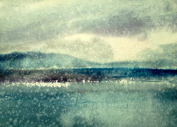
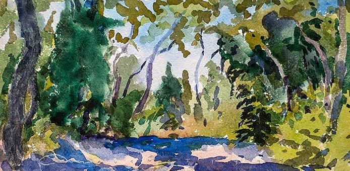
Huerfano Sinkhole
How do we end up in a particular place at a particular time? Eighteen years ago I found myself sitting in a small canyon in southern Colorado painting watercolors. We were looking at a piece of land to buy, a quixotic scheme to create a retreat place for artists. The land in question – the one in this watercolor – was a bad choice: it was entangled politically, situated next to some difficult neighbors, on forbidding terrain with virtually no building sites, and it wasn't for sale. But its rugged beauty was calling to us. I guess that's what the Sirens in mythology did to lure foolish sailors onto the rocks. As it happened we ended up buying something a mile down the road, a much more suitable tract, unencumbered, and with nothing but building sites. The siren of the artists' retreat still sings, time passes, and sometimes I wonder why I spend the lonely nights dreaming of a song. The melody haunts my reverie and I am once again with you. Ah, but that was long ago. Now my consolation is in the stardust of a song.
New Moon ~ October 4th, 2013
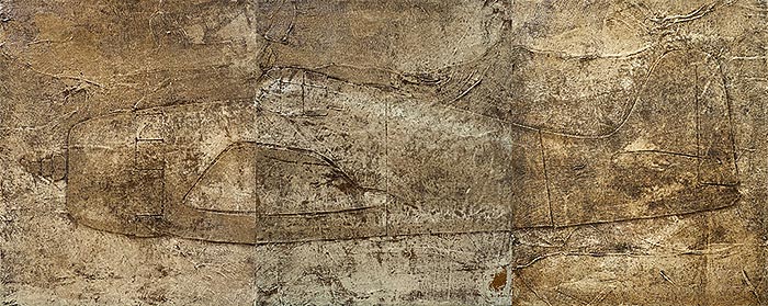
Mitsubishi Zero
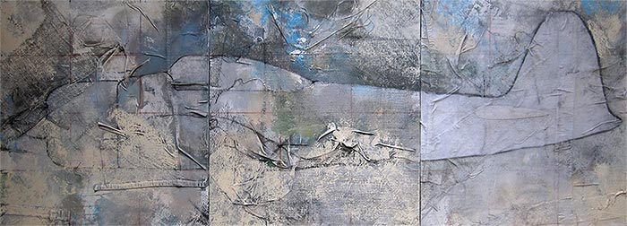
This is a work in progress, started just a few weeks ago; the visible image is emerging from a previous experiment from about ten years ago. Japanese culture has always venerated the re-use of materials; paper that had been previously used was often added to paper being made from new fibers. The fibers in use for centuries were extremely durable and could be re-vitalized in this way repeatedly. It was thought that the older paper had absorbed something of the life of its users and of the time in which it was made. There is a similar view amog the Gees Bend quilters in Alabama. These women have said that they prefer working with cloth salvaged from discarded clothing; new cloth doesn't have the whatever-it-is that makes something feel alive. When papermaking made its way to Europe sometime in the twelfth century of the current era, it was made from discarded linen garments. Many of the books made during the Renaissance are still in usable shape; their paper, especially, remains bright and supple. Hidden within the paper's fibers are the heartaches, thrills, aspirations, and disappointments absorbed by countless garments and household cloths of all the people of that era. What does any of this have to do with a half finished painting of a World War II fighter plane, one from the losing side? Perhaps it's the recycling of disused memories and fears whose potency has long expired. Or maybe it's the eerie resemblance of these old fighter planes to ancient Mediterranean sarcophagi, the stone coffins of the dead.
Full Moon ~ September 19th, 2013
Björk's Left Hand
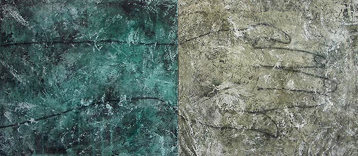
This is another painting from the Outliers rack, work that seemed to go off in its own direction that I couldn't see fit to keep at the time. So, yes, it's gone; probably painted over with some fruit or who knows what.  I suppose I could do another one. The image is the left hand of the prolific Icelandic singer and artist Björk Guðumundsdòttir. Björk's originality as a singer and composer is unusually true; it is raw, sometimes difficult, frequently beautiful but reliably free of invention for its own sake. This is hard to do in world where creativity and commerce have spawned a lot of really terrible art. Björk operates in a different universe, which in the end is this universe, the one we all live in. Her work is highly disciplined play, with all the wonder and wierdness of childlike invention and engagement with whatever is at hand, with this. Oh, and the painting: it was on two panels, probably about 26″ by 56″, acrylic and charcoal on canvas, probably done shortly after the turn of the century.
New Moon ~ September 5th, 2013
Two Tin Cups
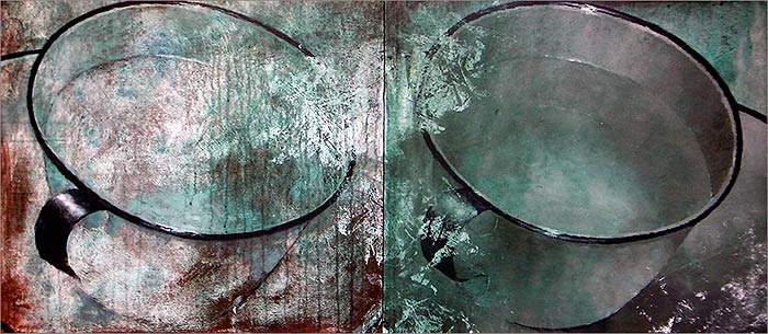
I have many paintings that no longer exist, mostly because I had some reason at the time to paint over them. I'm not the type to destroy all my previous work in a frenzy of self-destruction, but maybe I should hold off a bit and give things a chance to show themselves. I do run across paintings like this diptych that I wish I still had; I did it about ten years ago and it seems to be getting at something that I'm only now beginning to see. The subject of cups comes up from time to time, and had already been in play in my work for some years prior. And why not paint two of them? Part of the pleasure of these tin cup paintings was figuring out how to create the illusion of water inside the cup –just a trick, really. These have a further quality of deterioration that appeals to me. There are things in painting and in life itself that seem to “do themselves”; and this “self-done” quality resists contrivance, or perhaps their ambiguity invites participation. Or maybe they invite some kind of sympathy: you'd like to help them out, either as a viewer or at the time of their painting. This painting is 26″ x 56″, acrylic and gesso on canvas.
Full Moon ~ August 20th, 2013
Grumman Hellcat
This painting, a three-panel piece from the summer of 2012, was part of a series of World War II-era planes –mostly fighter planes– that I did for my sabbatical exhibition at Naropa University. One viewer of this painting remarked that it resembled a sarcophagus from an ancient Egyptian tomb. This resemblance is haunting, given the job that the plane was designed for and the fate of many of its pilots. When the tools of old wars –especially wars still in living memory– are found in remote jungles, on mountaintops, or in deep water, all that remains of the heroism and swagger is the sadness of loss and futility.
New Moon ~ August 6th, 2013
Olde View of the Sea
For the moment, I'm calling this painting Olde View of the Sea. Don't take the title too seriously; I just made it up. There is risk in giving a title to a painting: it can rob the viewer of the pleasure and creativity of uncertainty. When I was younger I generally avoided art museums because they induced a sometimes overwhelming lassitude; I would need a nap within twenty minutes of arriving. The reason, I discovered later, was that I felt obligated to read all the verbal descriptions beside each piece of artwork. It took some years to realize that these descriptions were nearly arbitrary and frequently not much more than subjective guesswork. But most of all, the words colored my experience of the paintings, literally interfered with creative engagement.
The language of painting is visual and pre-verbal. The written descriptions – and that includes titles – can be useful or illuminating if they are encountered in the right sequence, that is, after, not before, seeing. Perhaps if I call this simply Painting the viewer would be free to construct and enjoy any number of subjective associations, or none at all. And by the way, I love art museums now and can spend hours sauntering about. All I needed to know was the sequence: look first, read later (if at all).
New Moon ~ July 8th, 2013
Sheila and Peter's Beetles
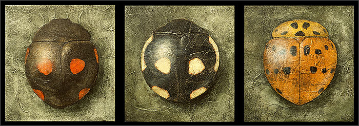
Three paintings. (Perhaps I'm making up for missing my usual update for the last full moon.) I did these paintings during the past year for a variety of venues: the La Veta Fine Art Gallery, Naropa University, and the Denver Botanic Gardens. My friends Peter and Sheila Dierks acquired these at my recent Denver Botanic exhibition. I never thought of displaying the paintings as a trio until seeing them up in their new home. I liked the arrangement enough to show them here on the homepage. They are small paintings, 22″ x 20″, acrylic on canvas with collaged canvas and cheesecloth.
New Moon ~ June 8th, 2013
Chautauqua Bees
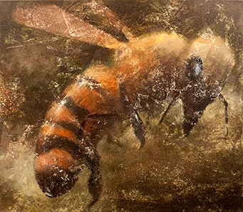
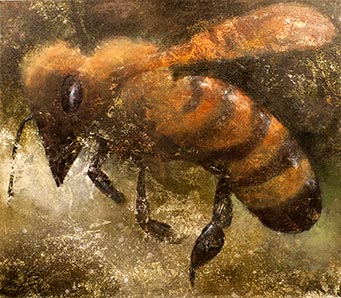
These are recent bee paintings, done on commission for the newly renovated Chautauqua dining room in Boulder, Colorado. The adventure of renovating and operating this venerable restaurant was recently taken on by Sara and Lennie Martinelli, two inspired and highly energetic area restauranteurs. The dining room dates back to the late nineteenth century, and has always been a charming but cavernous place. The Martinelli's have renovated it beautifully, adding fireplaces and incorporating tasteful changes some subtle, some dramatic, making the environment much more inviting. The building is regally situated on a hill in the historically designated Chautauqua district overlooking a large, tree-lined green and an unbroken vista of Boulder and the foothills. This is starting to read like ad copy! I suppose it is. I'm happy to have my art associated with an enterprise like this. The Martinelli's are part of a quietly growing renaissance of local farming, good food, and sane living.
Bees have been a recurring theme in my paintings for several years now. I suppose you could say that this is a romantic and possibly futile response to the plight of bees and their unexplained massive die-offs. Perhaps it's a form of reverence or even comradeship with the bees. After all, we inhabit the same land and suffer the same consequences of cynical carelessness. There really isn't any good reason why our species can't figure out how to live simply and properly. Let's start with food! Here's more on the Chautauqua Dining Room.
New Moon ~ May 9th, 2013
The Fifth Plague of Egypt
The Fifth Plague of Egypt: I made up the title as I was sitting here. This watercolor is part of an exercise from my Naropa watercolor classes that I call “proliferation”. The instruction is to complete fifty watercolors in a single, three hour class session. It's designed to overcome a number of things, especially timidity and preciousness, two tenacious impediments to watercolor practice. Doing this many paintings in rapid sequence can also give the hand a chance to outwit the conceptual mind and all of its hair-brained fears and schemes. This doesn't always work, but out of fifty paintings you usually get a few that will surprise you, especially when viewed later. You can claim that you did them deliberately but, really, they occurred by some means other than deliberateness. The paintings in this batch are small, about postcard size. Oh, yes, the title: The Fifth Plague of Egypt. Don't take it too seriously. I've always been fascinated by nineteenth century paintings of cataclysm; they are that era's version of present day post-apocalyptic and dystopian films. Perhaps the full title for the painting here could be A Quick Watercolor Sketch of the Apocalypse
Full Moon ~ April 25th, 2013
Alum Crystals
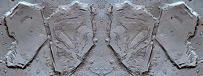
This isn't a painting. It's a photograph of alum crystals taken through a microscope. When I was ten or eleven years old, my parents gave me a Handy Andy™ microscope kit. It was one of those life-changing items; I'm still at it. There were many years when I didn't have a microscope nearby (the Handy Andy is long gone) but some time after my mother died in 1999 I found myself buying an old Swift™ microscope at a flea market. I'm sure that at the time there was something soothing about re-entering the world of wonder that a microscope opens up. Now I have several microscopes, including the fine old Leitz unit from the 1970s that I used to take this picture.
One of the many experiences in artistic practice is work that springs from wonder. Wonder is too often left out of art training and “elevated” aesthetic discourse, probably because it's so uncontrollable and not amenable to logic. Awe will visit a mind that isn't pre-occupied, and it can go straight to the heart of what moves you. This is a most profound kind of incitement. I don't know if I'll ever do paintings of crystals, but pondering them through a microsope generates a welcome buzz of wonder and possibility.
New Moon ~ April 10th, 2013
Wellfleet Bay Audubon Society
The Massachusetts Audubon Society maintains wildlife sanctuary in Wellfleet on Cape Cod. Much of the site was originally deforested and abandoned pasture land in the early 1900s; it's restoration to a teeming wildlife refuge is a fine example of someone taking on a piece of abused land and patiently restoring it, knowing that they would never live long enough to see the fruition. There are many fine walks through woods and along marshes, beaches, and sand flats. This watercolor from 1994 was done on location in a quiet path. I prefer to work surreptitiously, probably for the same reasons that I almost never answer the telephone and sometimes duck into another aisle in the supermarket rather than risk a chance conversation with someone I know - even if it's someone I love! Do you think it might be why wild animals run away when they see people? Probably not.
When I see this watercolor now –almost twenty years later– so much of the quality of the day comes back: the smell of the nearby shore, the cool air, the sandy earth, the dappled light, the solitude. This is one of the persistent benefits of engaging in painting or drawing from life; it's a kind of living-world download that seems to go much more deeply into memory than just looking or snapping a picture. Some might dismiss traditional painting and drawing as quaint vestiges of a more Romantic era. I believe that the activity, which goes back at least thirty thousand years among humans, can be a powerful connecting tool, one that could help to re-establish a healthy relationship between humans and all phenomena.
Full Moon ~ March 27th, 2013
Bananas
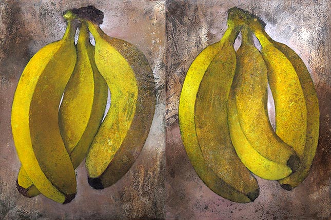
Here is a diptych of bananas I painted a few years ago. It was probably more like five years ago, some time shortly before the punctured world economy started hissing air. It had been an interesting time: lots of people with money to spend. Some of them even bought art. This was a period of time when I was doing a lot of paintings of fruit and vegetables. I honestly don't know how I got started on this, but it goes way back into the 1970s when I took a life drawing class at Massachusetts College of Art. Somehow, I had graduated without ever taking a life drawing class. (It was a period of “revolution” and experimentation, and some perhaps not well considered curriculum deletions.) The teacher of this class was named David Sipress, who would years later become a regular cartoonist for the New Yorker magazine. Anyway, this class set me on a path of learning how to draw in a literal fashion, without feeling the compulsion to be “creative” or “expressive”. This practice continues to this day and informs how I teach my Advanced Drawing class at Naropa University. Still, some people think all I do is paint fruit; in fact, I've been referred to as “The Fruit Guy”. I don't mind, really. This painting is 40″ x 60″, acrylic on canvas in two panels.
New Moon ~ March 11th, 2013
Kimiko's Lily
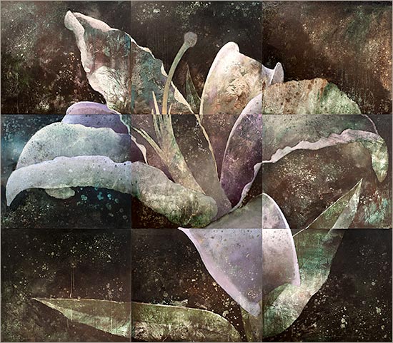
This painting is featured in a current solo show at the Denver Botanic Gardens. It has been in and out of the works since 2005. The nine panel form comes from a lifelong fascination with grids, which I first learned about while in elementary school. This painting is fairly large, 7 by 8 feet, so the multi-panel grid also serves a practical function during storage. The name Kimiko's Lily comes from a gift lily that our friend Kimiko gave while taking a painting class with my wife Joan. The flower lived out the rest of its days on our dining room table and was the focus of much admiration.
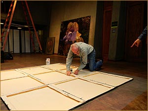
The Denver show has work that is brand new and work like this one that has been in progress for several years or more. Here's an action shot of the hanging in progress a few days ago that gives a sense of the scale of this piece, which I started in 2005 and finished just a few weeks ago. The painting really did start out as a lily painting, unlike some other recent works that have morphed across galaxies of imagery.
This is part of a series of nine-panel paintings – mostly of flowers but some of sea shells and one of a skunk skull that I found. (I planned, but never started the skunk skull. Yet.)
The variations in color and value from square to square result from doing each panel separately, and later joining them together, which accounts for the slight mis-alignments. At the time, I was interested in how these anomalies are accommodated during viewing. Somehow the mind assembles a coherent whole in spite of variations. That still interests me. Perhaps it's a metaphor for how we assemble what we call a life from an astonishing mish mash of people, activities, and random events, none of which quite line up.
Full Moon ~ Febuary 25th, 2013
Two-Spotted Lady Beetle
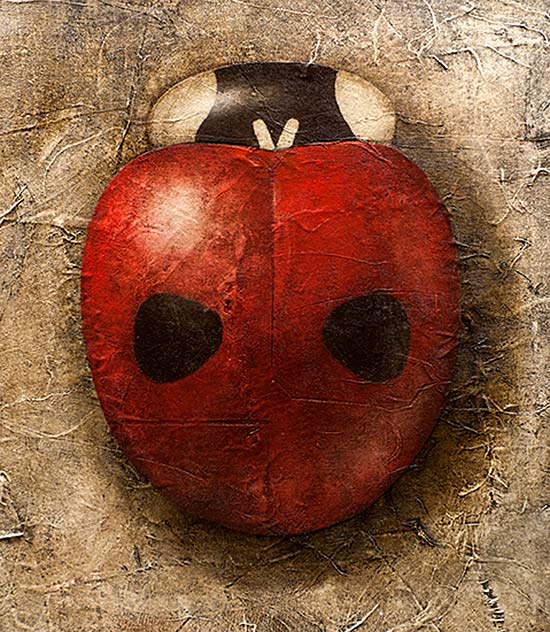
This painting is one of a threesome on view at the Denver Botanic Gardens. I started preparing the canvas while I was on a one-semester sabbatical almost ten years ago. Since then the painting has come in and out of retirement with long rest periods – some of them lasting a few years. But one thing is certain: it was not planned as a lady beetle painting when I started it in 2003. A lot of things seem to go that way in life. Our schemes and plans, no matter how well laid, seem to have plans of their own.
New Moon ~ February 10th, 2013
Near Moffat Tunnel
I'm guessing that this was done during a mountain hike somewhere around 1994. One of the features of living along what they call “the front range” in Colorado is the option to be in vast wilderness within less than an hour. You can go east into the prairie or west into the mountains. This particular hike started near the east portal of the Moffat Tunnel a railroad tunnel just west of Rollinsville, Colorado, a strangely haunted place dotted with isolated cabins and within earshot of the tunnel, with its huge fans periodically giving forth a moaning that echos through the silent forest and across the ridges. Twenty-eight workers died in the construction, carried out in the 1920s. And who knows what other denizens are disturbed when ambitious men set to work on a mountain with picks and dynamite.
The day of the hike was a dramatic mix of sun and clouds. One moment we were bathed in sunlight, the next we were inside a cloud. The scene of this watercolor was mostly above treeline, probably at 11,000 feet above sea level. I often find the feeling around mountain tops to be a mix of thrilling and sad; and I'm never sure why.
Full Moon ~ January 26th, 2013
Twice-Stabbed Lady Beetle
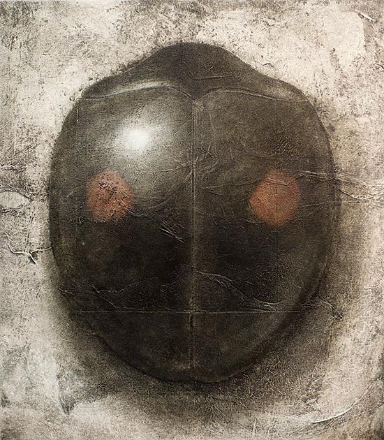
This painting of a lady beetle with the terrible name (it really is called a twice-stabbed lady beetle; it's official name is Chilocorus stigma, although I doubt that the beetles address each other using either name) is with seven of its companions en route to the Garrison Institute in New York. It's one of a series of eight paintings I did at the invitation of the Garrison Institute for a show this winter and spring. I took the opportunity to produce a set of paintings on one theme, to be exhibited in an environment where people on retreat could see them with an ordinary frame of mind, not complicated by a requirement to “look” at “art”.
Paintings have a tough life these days. It takes time to see a painting; it can take hours, days or even years to really see a painting. This is not something many people have time for. I think the trick is to place paintings where people see them regularly and often, perhaps without even realizing it; this can provide a way of seeing without effort or seeing without a conceptual framework.
The upcoming exhibition at the Garrison Institute is January through March. Once the semester gets under way, I'll put up a new section here on the website to show the Garrison paintings and the upcoming exhibition at the Denver Botanic Gardens – more on that later.
New Moon ~ January 11th, 2013
From the Old Book of Pears
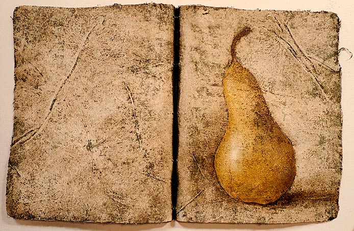
I've been busy these past few months getting ready for two upcoming solo exhibitions, one at the Denver Botanic Gardens and one at the Garrison Institute in New York. Both shows will continue with themes started last summer: beetles and ancient roughness. For the Denver Botanic Gardens show I'll be re-visiting fruit and flowers along with the beetles and bees. The painting here is a recurring attempt to summon the wizened poetry of a well-worn old book. This endeavor sometimes brings to mind the defrauding skills of the display business that I worked in after graduating from Massachusetts College of Art. I suppose the display business wasn't much different from theater set design, just a bit more crass. Perhaps these attempts at re-creating the look of time-worn book pages with their crude but still functioning bindings is not that different. Perhaps any artistic venture is not that different. Perhaps any behavioral facade is not that different from either the display business or theatrical set design. It needn't be thought of as chicanery; it could be all play.
This piece, which is somewhere between a three-dimensional object and a painting is about 19″ x 39″; it's acrylic, canvas, and cheesecloth on canvas, tied with jute. Oh yes, the upcoming exhibitions: Garrison Institute is January through March; Denver Botanic Gardens is February 13th through May 12th, 2013
Full Moon ~ December 28th, 2012
Grumman Goose
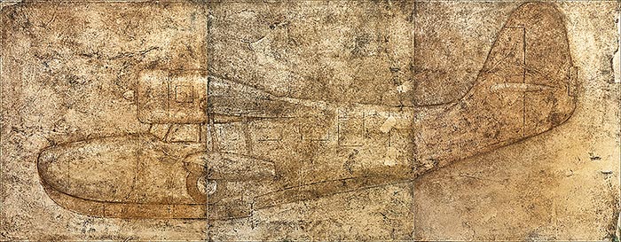
The Grumman Goose seaplane. This painting is a triptych, part of a series that I've been calling Aeroplanes, started last summer for my Sabbatical Exhibition at Naropa University. What is it about style that ages? Leaf through a magazine from ten or twenty years ago and you can feel the passage of time. Some things hold up better than others. (Look back at some high school photos of yourself and your friends: how about that hair?) The mid-twentieth century was, in my opinion, a golden era of style in the United States. Everything from clothing to hairstyles to portraiture, cars, films, architecture, housewares, and music conveys enduring elegance and panache, an unexpected feature of an era of sustained economic depression.
Many of the planes from that era –both civilian and military– while outmoded technologically, still hold their own in the style department. The design of the Grumman Goose resulted from a 1930s commission by some wealthy New York businessmen wanting to commute into the city easily from their Long Island getaways. The plane later proved to be a versatile troop transport plane during the Second World War. A number of Grumman Geese are still in use today; I'm pretty sure I saw one make an appearance in the 1997 David Mamet film The Spanish Prisoner. This painting is acrylic, gesso, cheesecloth, and molding paste on canvas, in three panels 42″ x 108″ overall. Why a Grumman Goose? I don't know...maybe it's a Christmas Goose.
New Moon ~ December 13th, 2012